
Airbnb’s new homepage design – helping customers find a unique holiday experience
In 2022 Airbnb launched its new homepage design. This is specifically aimed at supporting holiday-goers looking for Instagram-worthy accommodation that meets their needs (in a post-pandemic world). We’ve seen a vast range of holiday websites change their marketing strategy, but this move by Airbnb has stood out for us the most.
In line with this change, we have conducted research to understand what users think about the new designs, and how it compares to the original. This identifies if it will aid a user, helping them to find the accommodation type that they desire.
Head of Creative Design, Jane Seymour, gives her perspective on how user-friendly Airbnb’s designs are, and how they appear from a design perspective.
What has changed for Airbnb?
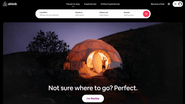
Previously, the homepage by Airbnb was very focused on a user inputting their requirements. For example, location, dates and the number of people presented them with the most relevant results.
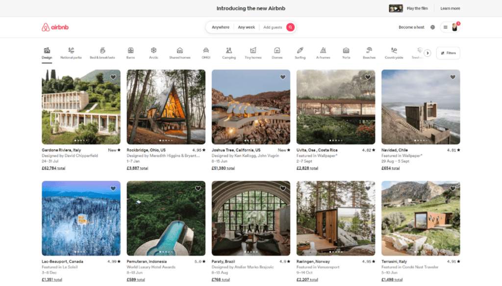
Now, the new homepage provides website users with an array of quirky accommodation options, alongside the same search functionality. To further support the large range of accommodation that’s on offer, Airbnb also added in filtering functionality. And this allows users to search for anything from “OMG!” to “Tiny home” categories.
Old design:
New design:
Is the change a positive one?
Out of 15 people that we surveyed, only 1 thought that the new homepage was an improvement and would aid their browsing experience. Core themes that came out of the research showed us that people thought the old homepage was:
- Simple and engaging.
- Less busy and less overwhelming than the new homepage.
- Straight to the point.
- Impactful
Here is what Head of Design, Jane Seymour, has to say about the designs: What are your thoughts from a design-specific perspective?
Simplicity. Something we all prefer, right?
Well, that certainly seems to be the general consensus based on feedback on Airbnb’s latest homepage update. We gathered a range of opinions on the new vs. old designs and usability; there was certainly a theme.
The majority of the group much preferred the old-style homepage, using phrases such as “simple”, “slick”, “clean”, “less busy”, “less confusing”, “minimalist”, and so on. On the other hand, after really delving into this big homepage change, we explored how this could be a much better performing experience, to aid holiday shoppers and encourage a more creative experience.
What are the pros and cons of this bold new change?
Pros:
- Let’s face it, it may be different to what we’re used to, but it still looks great. It’s well designed, well laid out and pretty easy to use because of it.
- There is a nice use of iconography. These simple and understated shapes are an effective visual nod to each of the categories. They represent each of them well, and its generally clear what you’re going to get if you click on them.
- Airbnb has done a good job of keeping things familiar so that users don’t feel like they are using a completely different page. The same logo placement is used, the same account nav, and a similar-looking search bar is placed in the centre. (I’ll touch on this in cons)
- The use of photography is striking. After all, that’s what sells this product, and its photo-focused approach highlights this.
Cons:
- It’s different. It seems like an obvious point to make, but people tend not to like change, especially with something that seemed to work so well before. As we know from our survey, the majority of people preferred the old design. So if it ain’t broke don’t fix it.
- Browsing or tailoring? The new, image-focused homepage gives the impression of a shopping product page. By implementing this layout, we automatically use it as a browsing exercise. And although this functionality isn’t new to us as consumers, it comes away from the way we previously would search for holidays. This makes it less of a ‘tailored to you’ kind of approach and depersonalises the UX.
- Is it too busy? Maybe not when you compare it to other sites, but if you look at how simple the old homepage design was, the high population of images and information that you are faced with from the offset seems a long stretch from the minimal and clean style it once was.
- Search bar. Because of the new focus on the imagery, the focus has been taken from the search bar. Although it still sits in the same spot, top and centre, it appears smaller and less important. Again, this backs up the idea of pushing users towards a browsing experience, rather than a tailored one.
So, are Airbnb going to be the ones to change the way we shop for holidays? They have definitely made an impactful move. But is it too much of a change for us to get used to? Only time will tell!
Are you a fan of the new Airbnb homepage? Reach out to us on LinkedIn to let us know your thoughts. Or get in touch for more information on our offering.