Rockson First
Client
Service
- Design
Year
2025
We delivered a full rebrand which was cleaner, sharper, and more future-facing. We introduced a new colour palette that feels fresh but grounded, with supporting mock-ups tailored for use across platforms.
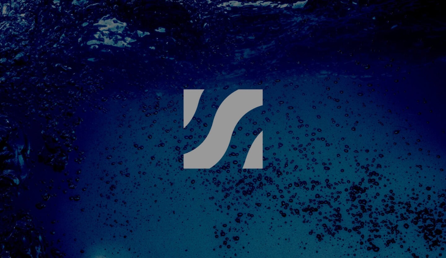
The lo-fi wave graphic was brought forward as a subtle but distinctive brand icon, paired with a contemporary typeface to modernise the overall look and feel.

Play


Ready to talk about your brand?
Get in touch today.
Find out how we can help.

Previous project
USN

Next project
