The theory behind colours, and how to perfect your palettes
There are 18 decillion different colours. But If you’re like me and have no idea what a decillion is, don’t worry – I’ve saved you from having to Google it! A decillion is 33 zeros. So, there are 18,000,000,000,000,000,000,000,000,000,000,000 different colours out there. Now let’s start again… there is an infinite number of colours out there, so how do we know if we’re using the right ones?
As a multimedia designer for connective3, it’s typically my job to ensure we’re using the perfect colours in every scenario. Working in a fast-paced digital marketing agency is extremely fun. I love being faced with new challenges, and we’re constantly working with exciting new clients. Some brands have strict colour palettes; others can be more playful and allow you to push the boat out with creativity. However, choosing the right colours is always a key factor in the design process.
Colours play an immensely important role in the world we live in. They can represent emotions, contribute to actions and influence reactions. Colours are not just different crayons on a piece of paper – as some of my colleagues would say.
Colours have the magnificent ability to influence decisions because they subconsciously represent actions in our day-to-day lives. The perfect example of this is traffic lights. Who sat down one day and decided red, amber and green would universally represent stop, wait and go?
Breaking down colours
To get a greater understanding of the theory behind colours, you first need to understand the key terminology that comes with them. Here’s a breakdown of the various components that make up one colour:
Hue – The true colour of something, for example, red or green.
Saturation – The strength or weakness of the colour.
Chroma – How pure the colour is.
Value – How light or dark a colour is.
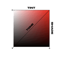
Tint – How much white is added to a colour.
Tone – How much grey is added to a colour.
Shade – How much black is added to a colour.
Visual representation
Colour models are also key elements in design which are often overlooked, but yet need to be determined at the start of a design process. You may be aware of the terms RGB and CYMK, but it’s crucial to understand the difference between the two. RGB stands for red, green, blue, and is used in the digital space as it’s how screens produce colour.
Monitors emit light, and with light, colours are additive meaning the more colours you add – the brighter the colour gets and vice versa. CMYK, on the other hand, uses white as the natural colour of the print background, and black as a combination of coloured inks. CMYK stands for cyan, magenta, yellow and key (black), and is the colour model most commonly used in print.
A key takeaway: Use the right colour model from the start to ensure consistency, as it’s a real pain to go back and edit.
The colour wheel
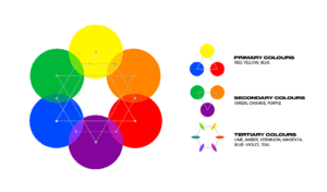
All colours are a mix of red, yellow and blue (the primary colours), with white/black being added to create different shades, tints and tones of them all. The colour wheel is an arrangement of all colours on the spectrum, based on their relationships. It displays primary, secondary and tertiary colours and is useful in creating harmonious colour schemes. Check out this diagram of colours below:
Visual representation
What do colours actually represent?
Colours have vastly different meanings all around the globe, so it’s important to do research for the area you’re going to represent. Nevertheless, here are some of the key connotations linked with colours:
Red: Love, anger, danger, heat, passion.
Purple: Royalty, wisdom, honour.
Pink: Romance, tenderness, love.
Beige: Conservative, unification, quiet, calm, and simplicity.
Yellow: Joy, happiness, summer, sunshine, hazard or illness.
Orange: Energy, warmth, vibrancy, enthusiasm.
Cream: Elegant, pure, calm.
White: Purity, simplicity, winter, innocence, cleanliness.
Grey: Security, maturity, boring, intelligence.
Black: Power, wealth, mystery, fear, anonymity, death.
Blue: Calm, responsible, peace, water, sky.
Green: New beginnings, nature, good luck, fortune, envy, and health.
Brown: Earth, stability, the outdoors.
Colour combinations and accessibility
Picking the right initial colour is only half of the battle. You’ve now got to figure out what works best alongside it. Choosing colours is also really important for accessibility. The human brain is generally very good at distinguishing colours, shapes and patterns.
However, there are a significant number of people who have to deal with colour blindness, meaning that they struggle to see and distinguish between some shades and colours. But don’t worry, there are some extremely helpful tools and guides that make life really easy.
Here is a guide to accessibility in the digital world, including much more than just colours, with guidance spanning from font size to audio levels. Adobe Color has recently added a feature which allows users to test contrast, and it also suggests similar colours which provide a better contrast ratio.
Here are the different ways of combining colours to get the perfect palette:
(Each palette example is built around the connective3 primary red)
Analogous Colours: Simple, visually pleasing and a calming display
This is when three (or more) colours are right next to each other on the colour wheel. They are usually composed of one dominant colour – typically being a primary or secondary colour – alongside shades of tertiary colours. Using a good mix of light, dark, and more muted colours is a top tip to make this a successful palette.
Monochromatic Colours: Basic, Uniform and professional
This refers to a selection of different tints, tones and shades of a single hue. This can be an easy way of creating a harmonious and cohesive palette.
Triad Colours: Vibrant and unique
This takes colours that are equally spaced around the colour wheel in a triangle, and is often used to create a unique and vibrant palette.
Complementary Colours: Common and contrasting
These are the hues which are located directly opposite each other on the colour wheel. Complementary colours are made up of one warm and one cool colour. This provides simultaneous contrast, which is the highest contrast available on the colour wheel.
Square Colours: Uncommon yet vibrant
Four colours are sourced at an equal distance from each other on the colour wheel. Use different shades and tints to ensure there is a contrast in the palette.
Compound Colours: Unique yet complementary
Instead of using colours that are opposites, it uses colours on both sides of the opposite hue. This usually entails a mix of 3 primary colours to create a contrasting, unique look.
6 steps to help you choose the right colours
- Colour model is essential – Figure out where your design is going, if it’s going to be printed, then use the CYMK model from the start. This will help you keep your colours consistent.
- Consider the meaning of colours – Think about what your design represents, don’t choose colours that are too far aligned from the sector you’re designing for.
- Look at trends – Colours are constantly going in and out of “fashion”, so make sure you’re not using outdated, eye-piercingly vibrant colours. For this, you can use sites such as Coolors for inspiration to see what’s trending right now.
- Make sure your colours work well together – Don’t use colours that have no business being together, use the colour wheel to determine what works and what doesn’t. If you want the easy way of doing it, then use an online colour wheel such as Adobe Color. This lets you to input what you want your primary colour to be and cycle through the different combination options, such as complementary and analogous colours. Palettes can also be directly imported into your creative cloud for ease of use!
- Don’t just settle for the basics – Play around with shades, tones and tints to get your favourite colours.
- Don’t use too many – Pick your favourites and what works well with them; designs should (in most cases) be a 60-30-10 split between colours.
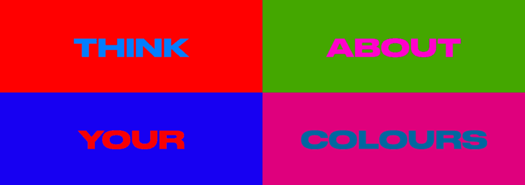
After all, you don’t want your branding to look like this…
So, do what the image says… if you can actually read it!
*Disclaimer – c3 cannot be at fault for anyone whose eyes have burned after looking at that image!*
If you’d like to discuss the perfect colour palette in more detail, or want to know how we can elevate your brand, please contact us for further information.


