Services
Our Services
See services page
Strategy
Strategy & Solutions
Digital Strategy – Maker Model
Innovation
Marketing Mix Modelling
User Research
CRO
Data Analytics
Brand
Social Media
Paid Social
Influencer Marketing
Content Creation
TikTok Shop
Social Listening
Creative
Content Production
Performance
SEO
Ecommerce SEO
Local SEO
SEO Website Migration
Technical SEO
Content Strategy
Branded Content
Content Writing
Video SEO Strategy
YouTube SEO Strategy
Digital PR
B2B Digital PR
C3 Newsroom
Celebrity Interviews
Data Analytics
Paid Media
Display & Video
PPC
YouTube Ads
Google Premier Partners
AI in PPC
B2B PPC
Sectors
Our Sectors
See sectors page
D2C Marketing
Ecommerce Marketing
Financial Marketing
Health & Beauty Marketing
Hospitality Marketing
iGaming Marketing
Retail Marketing
Travel Marketing
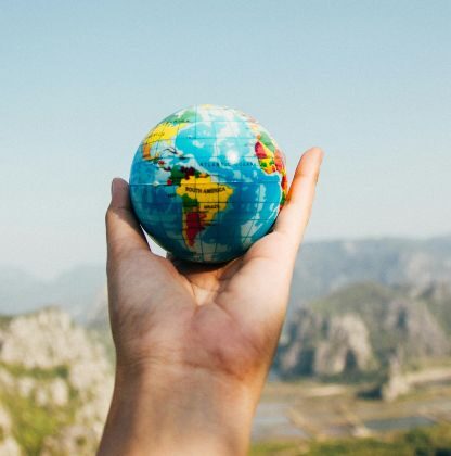
International
International
See international page
US Digital PR
French Digital PR
German Link Building
Spanish Link Building
International SEO
International PPC
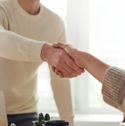
About
About
See about page
Meet The Team
Charity and Environment
Work
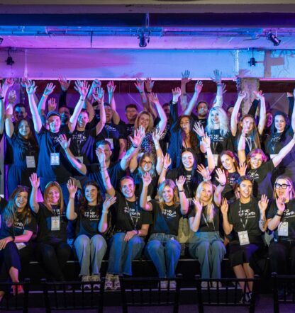
Events
Our events
See events page
Up North
Up North Agenda
Up North Speakers
Up North FAQs
Digital Bites
Insights
Contact
Services
See services page
Strategy
Strategy & Solutions
Maker Model
Innovation
Marketing Mix Modelling
User Research
CRO
Data Analytics
Brand
Social Media
Paid Social
Influencer Marketing
Content Creation
TikTok Shop
Social Listening
Creative
C360
Content Production
Performance
SEO
Technical SEO
Local SEO
International SEO
SEO Website Migration
Ecommerce SEO
Content Strategy
Content Writing
Branded Content
YouTube SEO Strategy
Video SEO Strategy
Digital PR
C3 Newsroom
B2B Digital PR
Celebrity Interviews
Data Analytics
Paid Media
Display & Video
PPC
YouTube Ads
Google Premier Partners
B2B PPC
AI in PPC
Sectors
See sectors page
D2C Marketing
Ecommerce Marketing
Financial Marketing
Health & Beauty Marketing
Hospitality Marketing
iGaming Marketing
Retail Marketing
Travel Marketing
International
See international page
U.S. Digital PR
German Link Building
Spanish Link Building
French Link Building
International SEO
International PPC
Work
See work page
Events
See events page
Our Events
Up North
Up North Agenda
Up North Speakers
Up North FAQs
Digital Bites
About
See about page
Who we are
About us
Meet The Team
Charity and Environment
Insights
See insights page
Careers
See careers page
Contact
See contact page
Our Offices
Get in touch
Next Event
31 Jul 2025
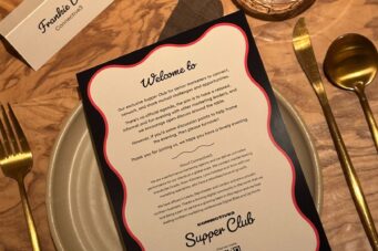
C3 Supper Club
Manchester
[email protected]
call
+44 113 5312480
Instagram
X
Linkedin
Facebook
YouTube
Search connective3
Search for:
Search
Welcome to our insights
What are you looking for?
Select a category
:
All
Analytics
Content Strategy
Design
Digital PR
Events
International
News
Paid
Reports
Resources
SEO
Social
User Research
News
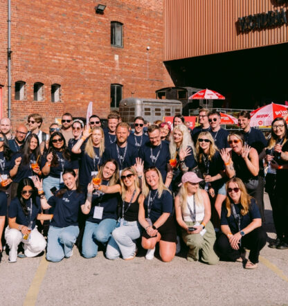
Up North 2025 wrap up
News
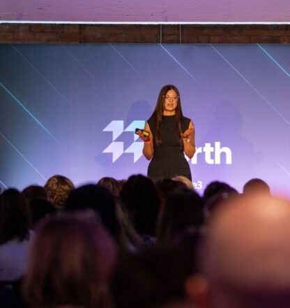
What to expect at Up North 2025
SEO
Maximising your local SEO presence
Digital PR
Utilising celebrity interviews to build your brand
Events
Introducing Up North 2025 – connective3’s marketing festival is back
Digital PR
How to create the perfect PR strategy for your home interior brand
View more
Featured reports
Digitising the U.S. marketing industry
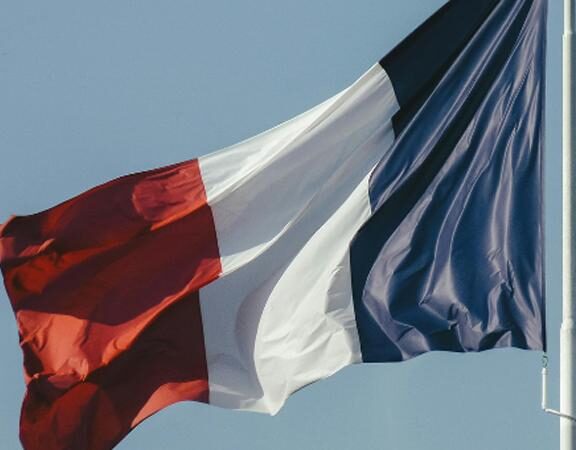
An introduction to the French media landscape
The U.S. Digital PR Guide